1.4 Specialty plots in base R
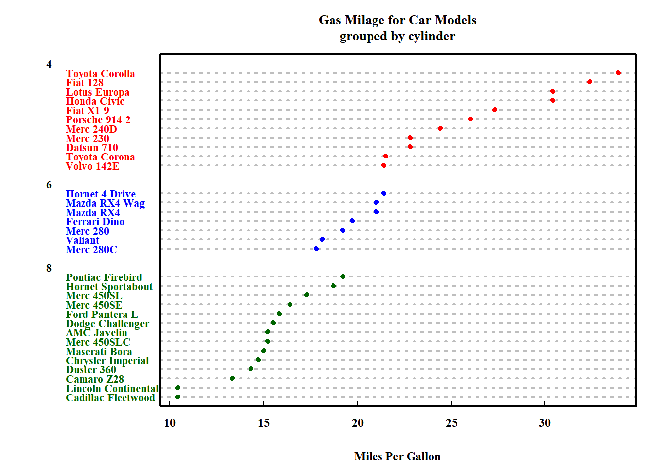
Functions to create several special plots exist such as Cleveland dot plots, barcharts and pie charts.
x <- mtcars[order(mtcars$mpg),] # sort by mpg
x$cyl <- factor(x$cyl) # it must be a factor

x$color[x$cyl==4] <- "red"
x$color[x$cyl==6] <- "blue"
x$color[x$cyl==8] <- "darkgreen"

dotchart(x$mpg,
         labels = row.names(x),
         pch = 16,
         cex = 0.7,
         groups = x$cyl,
         main = "Gas Milage for Car Models\ngrouped by cylinder",
         xlab = "Miles Per Gallon",
         gcolor = "black",
         color = x$color)
1.4.1 Bar plots
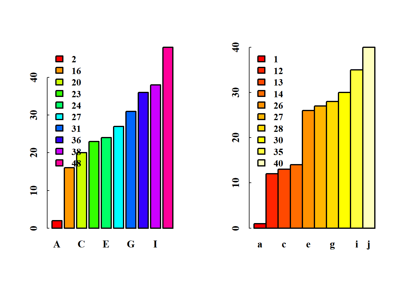
set.seed(NULL)

par(mfrow = c(1,2))

x<-sort(sample(1:50,size = 10))
y<-sort(sample(1:50,size = 10))

barplot(x,
        col = rainbow(10),
        names.arg = LETTERS[1:10],
        space = .25)
legend('topleft',
       legend = x,
       fill = rainbow(10),
       bty = 'n')

barplot(y,
        col = heat.colors(10),
        names.arg = letters[1:10],
        space = 0)
legend('topleft',
       legend = y,
       fill = heat.colors(10),
       bty = 'n')
1.4.2 Pie Charts
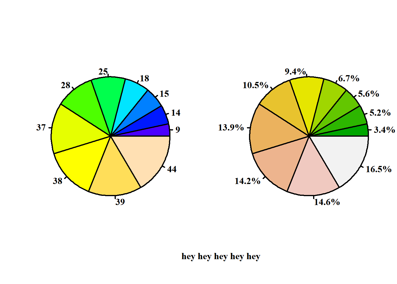
par(mfrow = c(1,2))

x<-sort(sample(1:50,size = 10))

pie(x,
    col = topo.colors(10),
    labels = x,
    radius = 1)

pie(x,
    col = terrain.colors(10),
    labels = paste(round(100*x/sum(x), digits = 1),'%', sep = ''),
    radius = 1)

par(mfrow = c(1,1))
mtext(side = 1,
      'hey hey hey hey hey',
      line = 2.1)