2.6 Managing Scales
Whenever you specify an aesthetic mapping, ggplot uses a particular scale to determine the range of values that the data should map to. Thus when you specify
# color the data by engine type
ggplot(mpg, aes(x = displ, y = hwy, color = class)) +
  geom_point()
ggplot automatically adds a scale for each mapping to the plot:
# same as above, with explicit scales
ggplot(mpg, aes(x = displ, y = hwy, color = class)) +
  geom_point() +
  scale_x_continuous() +
  scale_y_continuous() +
  scale_colour_discrete()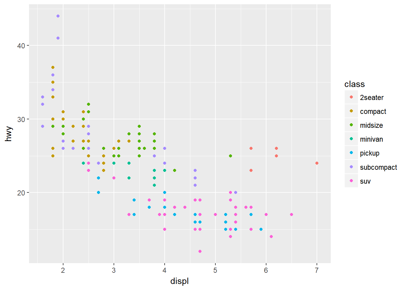
Each scale can be represented by a function with the following name: scale_, followed by the name of the aesthetic property, followed by an _ and the name of the scale. A continuous scale will handle things like numeric data (where there is a continuous set of numbers), whereas a discrete scale will handle things like colors (since there is a small list of distinct colors).
While the default scales will work fine, it is possible to explicitly add different scales to replace the defaults. For example, you can use a scale to change the direction of an axis:
# milage relationship, ordered in reverse
ggplot(mpg, aes(x = cty, y = hwy)) +
  geom_point() +
  scale_x_reverse() +
  scale_y_reverse()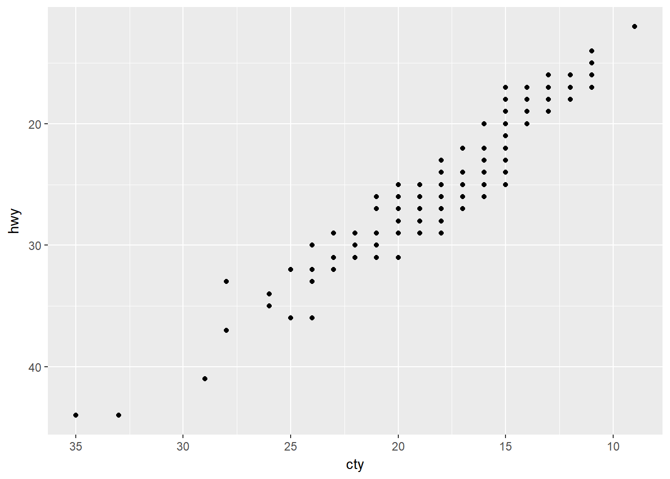
Similarly, you can use scale_x_log10() and scale_x_sqrt() to transform your scale. You can also use scales to format your axes:
ggplot(mpg, aes(x = class, fill = drv)) +
  geom_bar(position = "fill") +
  scale_y_continuous(breaks = seq(0, 1, by = .2), labels = scales::percent)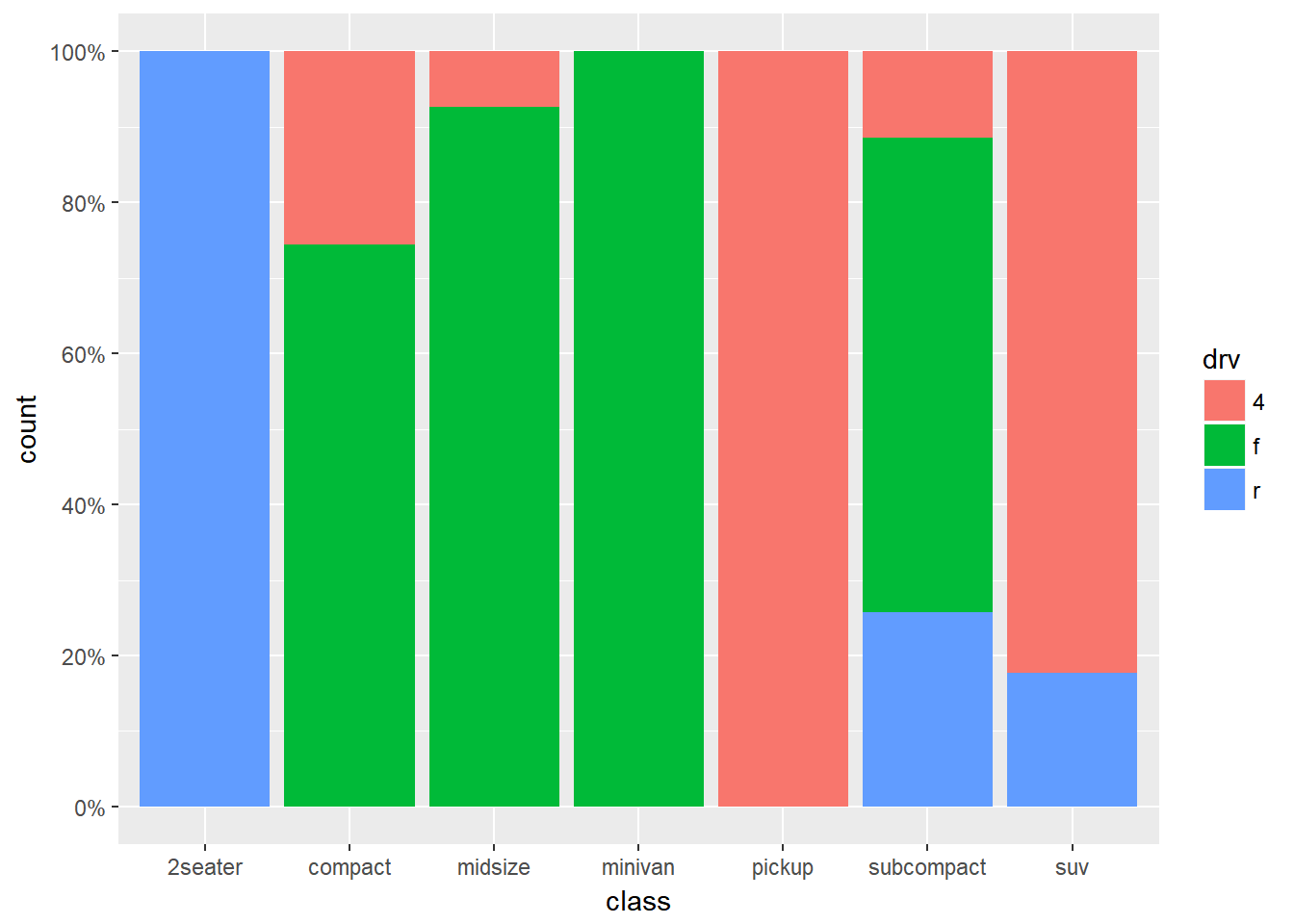
A common parameter to change is which set of colors to use in a plot. While you can use the default coloring, a more common option is to leverage the pre-defined palettes from colorbrewer.org. These color sets have been carefully designed to look good and to be viewable to people with certain forms of color blindness. We can leverage color brewer palletes by specifying the scale_color_brewer() function, passing the pallete as an argument.
# default color brewer
ggplot(mpg, aes(x = displ, y = hwy, color = class)) +
  geom_point() +
  scale_color_brewer()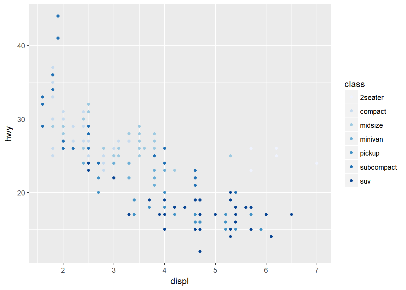
# specifying color palette
ggplot(mpg, aes(x = displ, y = hwy, color = class)) +
  geom_point() +
  scale_color_brewer(palette = "Set3")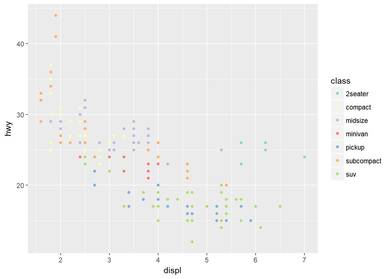
Note that you can get the palette name from the colorbrewer website by looking at the scheme query parameter in the URL. Or see the diagram here and hover the mouse over each palette for the name.
You can also specify continuous color values by using a gradient scale, or manually specify the colors you want to use as a named vector.