2.9 Labels & Annotations
Textual labels and annotations (on the plot, axes, geometry, and legend) are an important part of making a plot understandable and communicating information. Although not an explicit part of the Grammar of Graphics (the would be considered a form of geometry), ggplot makes it easy to add such annotations.
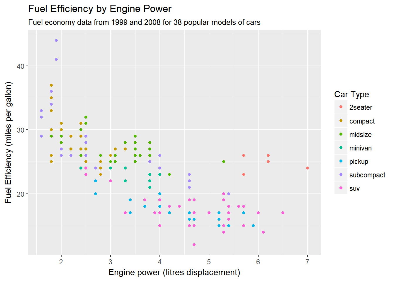
You can add titles and axis labels to a chart using the labs() function (not labels, which is a different R function!):
ggplot(mpg, aes(x = displ, y = hwy, color = class)) +
  geom_point() +
  labs(title = "Fuel Efficiency by Engine Power",
       subtitle = "Fuel economy data from 1999 and 2008 for 38 popular models of cars",
       x = "Engine power (litres displacement)",
       y = "Fuel Efficiency (miles per gallon)",
       color = "Car Type")
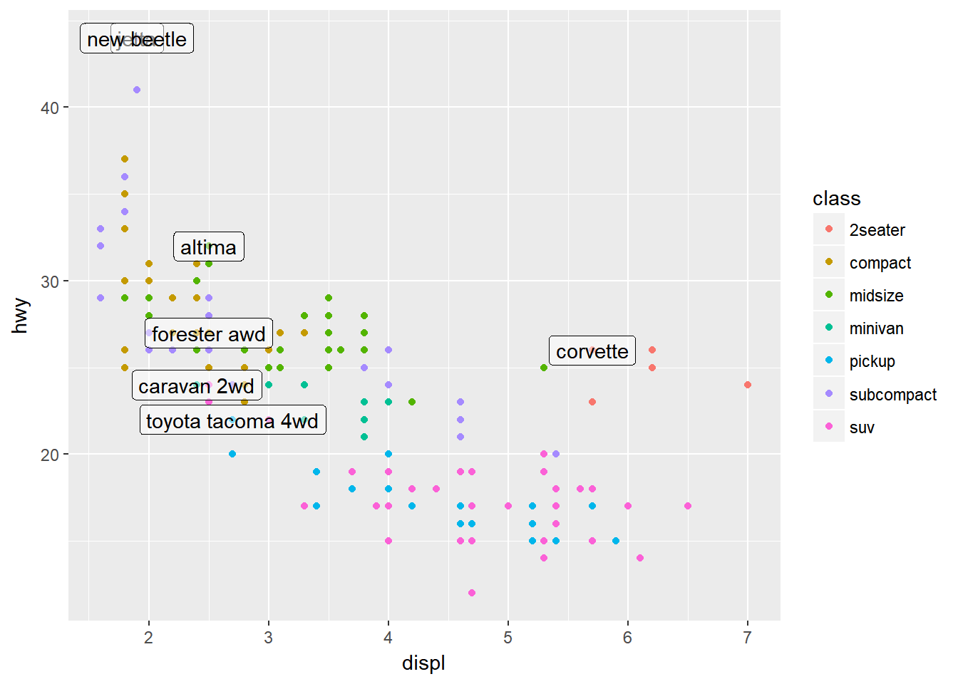
It is also possible to add labels into the plot itself (e.g., to label each point or line) by adding a new geom_text or geom_label to the plot; effectively, you’re plotting an extra set of data which happen to be the variable names:
library(dplyr)

# a data table of each car that has best efficiency of its type
best_in_class <- mpg %>%
  group_by(class) %>%
  filter(row_number(desc(hwy)) == 1)

ggplot(mpg, aes(x = displ, y = hwy)) +
  geom_point(aes(color = class)) +
  geom_label(data = best_in_class, aes(label = model), alpha = 0.5)
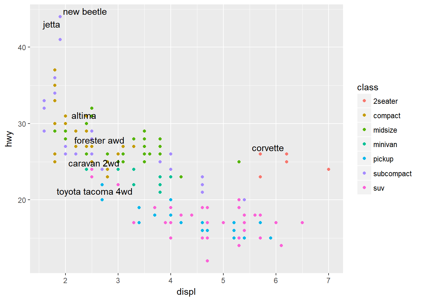
However, note that two labels overlap one-another in the top left part of the plot. We can use the geom_text_repel function from the ggrepel package to help position labels.
library(ggrepel)

ggplot(mpg, aes(x = displ, y = hwy)) +
  geom_point(aes(color = class)) +
  geom_text_repel(data = best_in_class, aes(label = model))