2.5 Specifying Geometric Shapes
Building on these basics, ggplot2 can be used to build almost any kind of plot you may want. These plots are declared using functions that follow from the Grammar of Graphics.
The most obvious distinction between plots is what geometric objects (geoms) they include. ggplot2 supports a number of different types of geoms, including:
geom_pointfor drawing individual points (e.g., a scatter plot)geom_linefor drawing lines (e.g., for a line charts)geom_smoothfor drawing smoothed lines (e.g., for simple trends or approximations)geom_barfor drawing bars (e.g., for bar charts)geom_histogramfor drawing binned values (e.g. a histogram)geom_polygonfor drawing arbitrary shapesgeom_mapfor drawing polygons in the shape of a map! (You can access the data to use for these maps by using themap_data()function).
Each of these geometries will leverage the aesthetic mappings supplied although the specific visual properties that the data will map to will vary. For example, you can map data to the shape of a geom_point (e.g., if they should be circles or squares), or you can map data to the linetype of a geom_line (e.g., if it is solid or dotted), but not vice versa.
Almost all geoms require an x and y mapping at the bare minimum.
# Left column: x and y mapping needed!
ggplot(mpg, aes(x = displ, y = hwy)) +
  geom_point()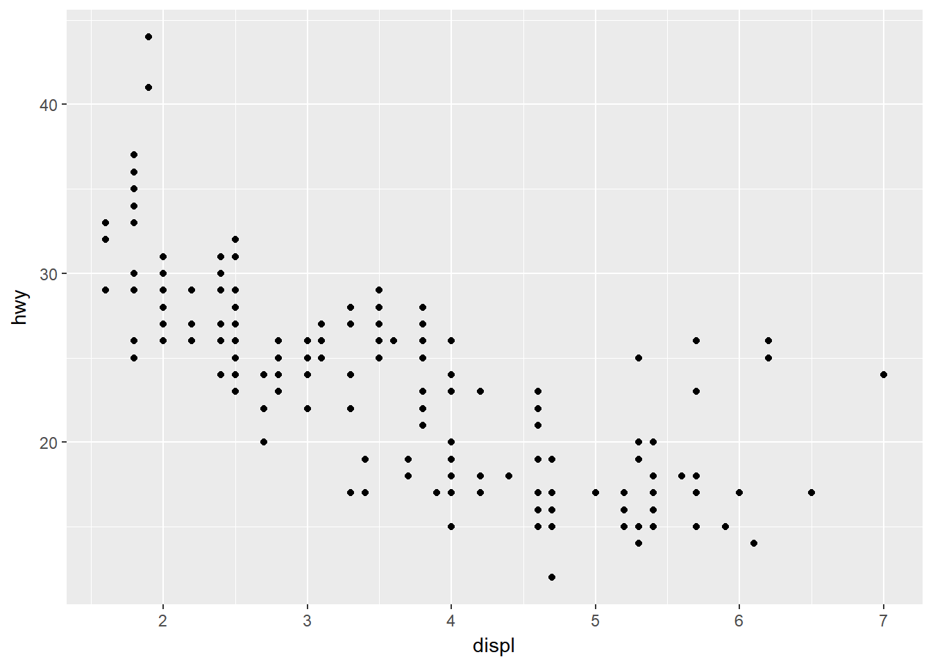
ggplot(mpg, aes(x = displ, y = hwy)) +
  geom_smooth()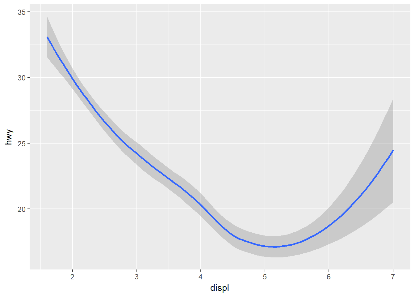
# Right column: no y mapping needed!
ggplot(data = mpg, aes(x = class)) +
geom_bar() 
ggplot(data = mpg, aes(x = hwy)) +
geom_histogram() 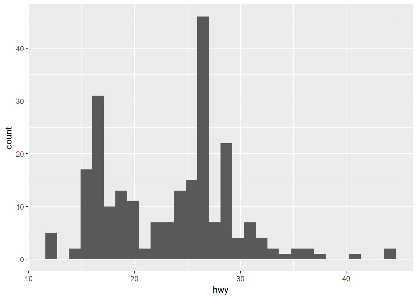
What makes this really powerful is that you can add multiple geometries to a plot, thus allowing you to create complex graphics showing multiple aspects of your data.
# plot with both points and smoothed line
ggplot(mpg, aes(x = displ, y = hwy)) +
  geom_point() +
  geom_smooth()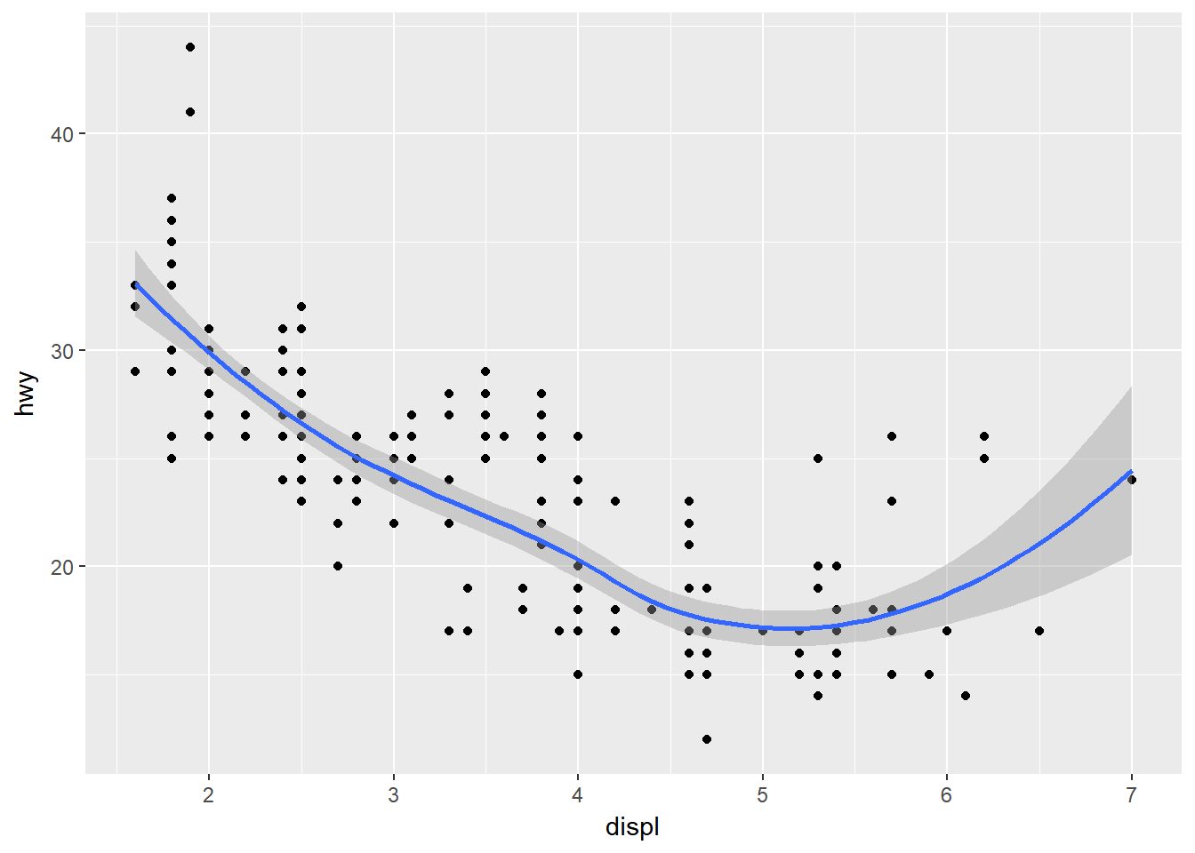
Of course the aesthetics for each geom can be different, so you could show multiple lines on the same plot (or with different colors, styles, etc). It’s also possible to give each geom a different data argument, so that you can show multiple data sets in the same plot.
For example, we can plot both points and a smoothed line for the same x and y variable but specify unique colors within each geom:
ggplot(mpg, aes(x = displ, y = hwy)) +
  geom_point(color = "blue") +
  geom_smooth(color = "red")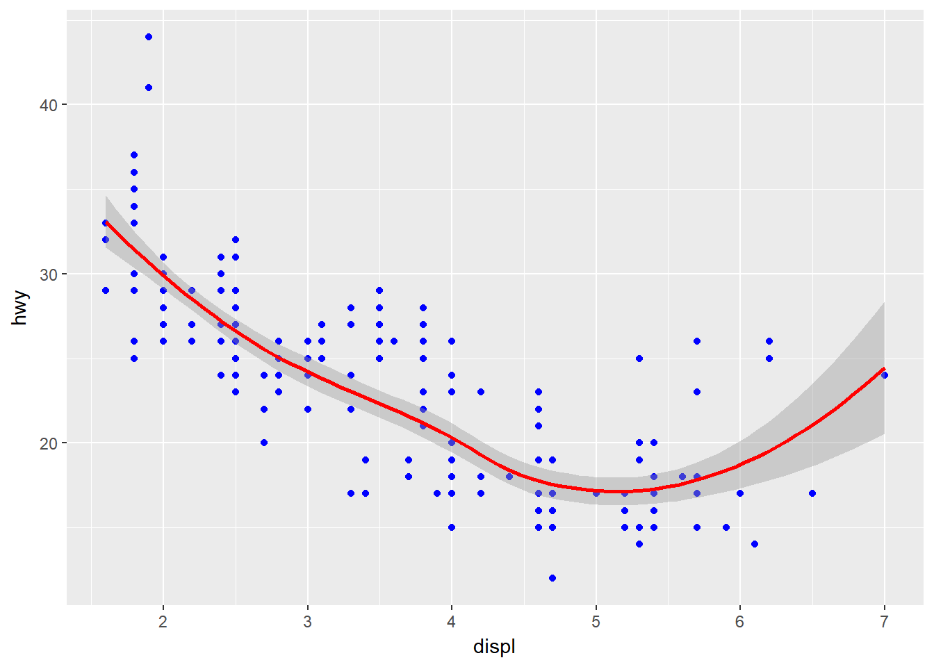
So as you can see if we specify an aesthetic within ggplot it will be passed on to each geom that follows. Or we can specify certain aes within each geom, which allows us to only show certain characteristics for that specificy layer (i.e. geom_point).
# color aesthetic passed to each geom layer
ggplot(mpg, aes(x = displ, y = hwy, color = class)) +
  geom_point() +
  geom_smooth(se = FALSE)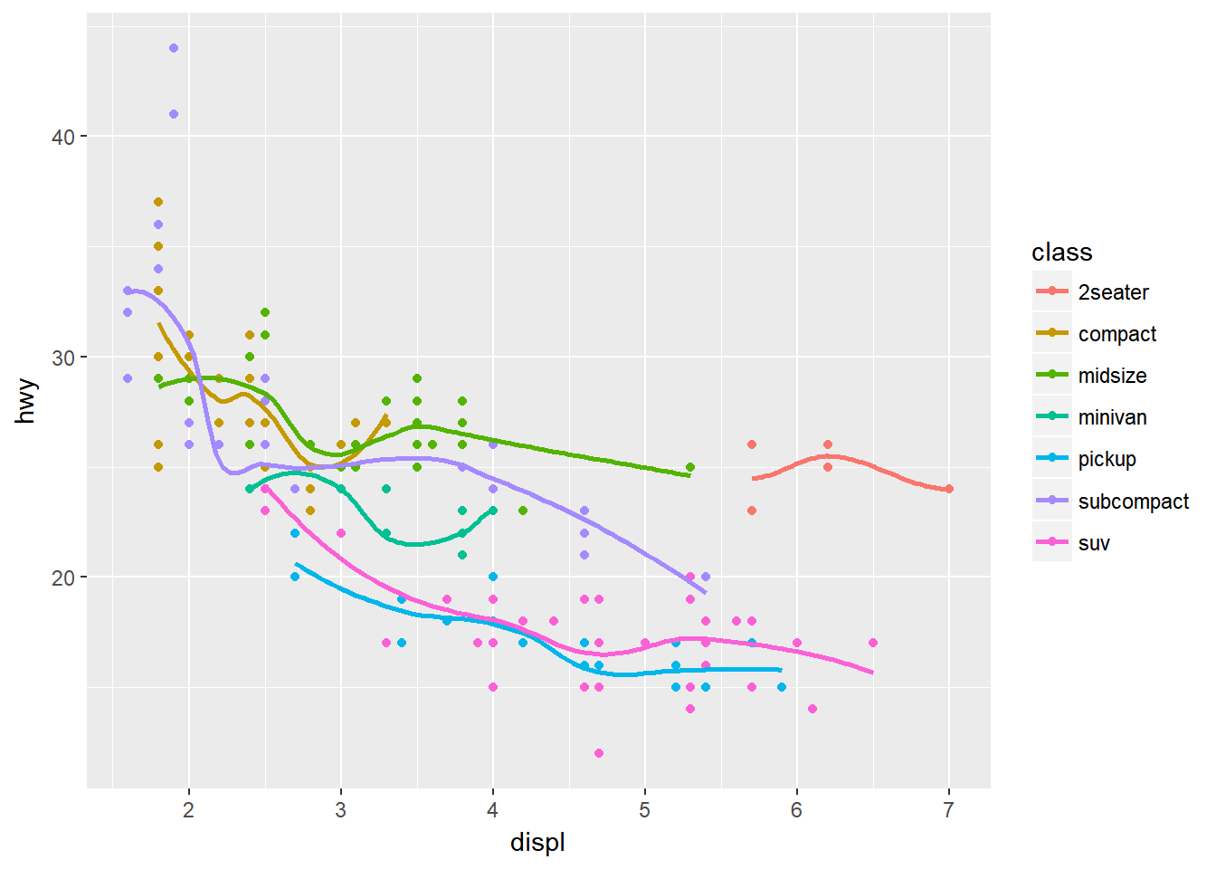
# color aesthetic specified for only the geom_point layer
ggplot(mpg, aes(x = displ, y = hwy)) +
  geom_point(aes(color = class)) +
  geom_smooth(se = FALSE)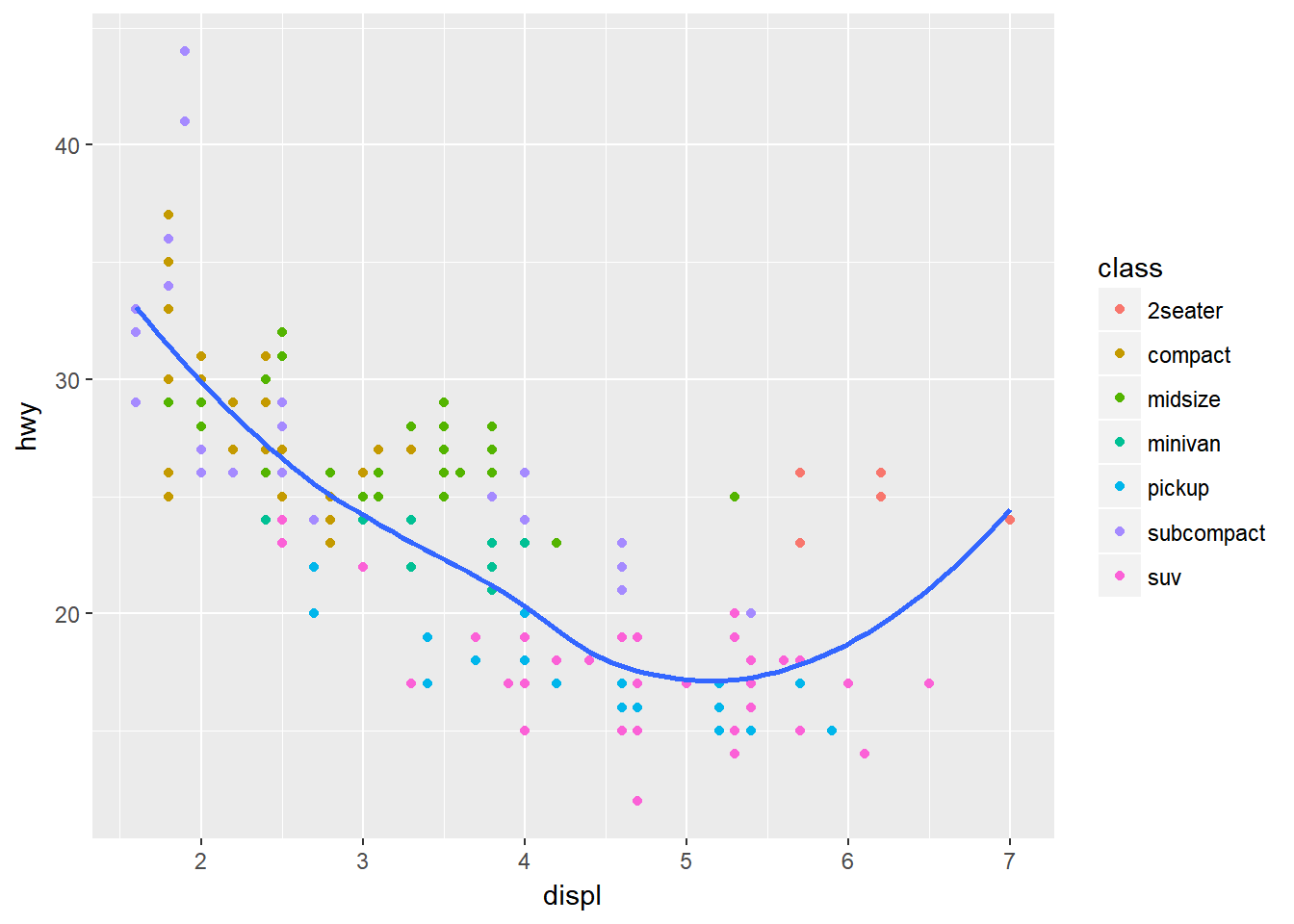
2.5.1 Statistical Transformations
If you look at the bar chart below, you’ll notice that the y axis was defined for us as the count of elements that have the particular type. This count isn’t part of the data set (it’s not a column in mpg), but is instead a statistical transformation that the geom_bar automatically applies to the data. In particular, it applies the stat_count transformation.
ggplot(mpg, aes(x = class)) +
  geom_bar()
ggplot2 supports many different statistical transformations. For example, the “identity” transformation will leave the data “as is”. You can specify which statistical transformation a geom uses by passing it as the stat argument. For example, consider our data already had the count as a variable:
class_count <- dplyr::count(mpg, class)
class_count
# A tibble: 7 x 2
  class          n
  <chr>      <int>
1 2seater        5
2 compact       47
3 midsize       41
4 minivan       11
5 pickup        33
6 subcompact    35
7 suv           62
We can use stat = "identity" within geom_bar to plot our bar height values to this variable. Also, note that we now include n for our y variable:
ggplot(class_count, aes(x = class, y = n)) +
  geom_bar(stat = "identity")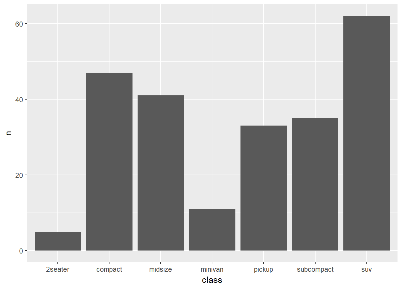
We can also call stat_ functions directly to add additional layers. For example, here we create a scatter plot of highway miles for each displacement value and then use stat_summary to plot the mean highway miles at each displacement value.
ggplot(mpg, aes(displ, hwy)) +
  geom_point(color = "grey") +
  stat_summary(fun.y = "mean", geom = "line", size = 1, linetype = "dashed")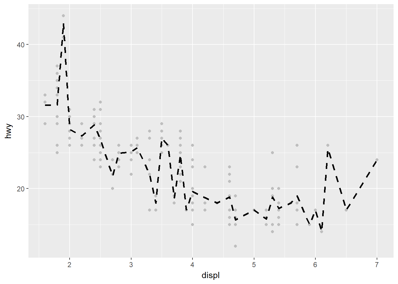
2.5.2 Position Adjustments
In addition to a default statistical transformation, each geom also has a default position adjustment which specifies a set of “rules” as to how different components should be positioned relative to each other. This position is noticeable in a geom_bar if you map a different variable to the color visual characteristic:
# bar chart of class, colored by drive (front, rear, 4-wheel)
ggplot(mpg, aes(x = class, fill = drv)) +
  geom_bar()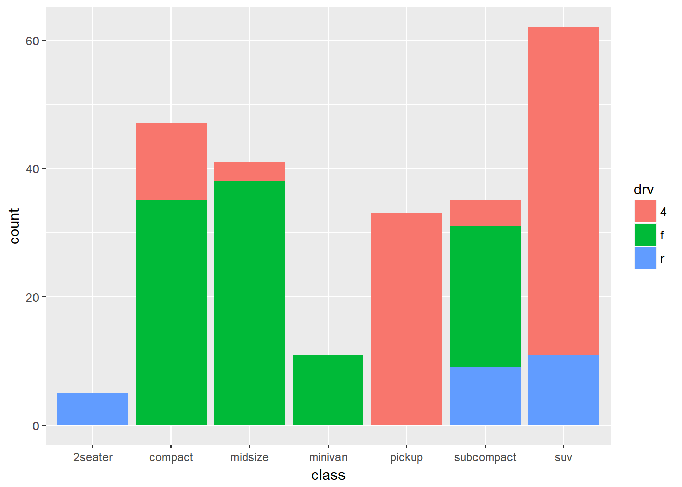
The geom_bar by default uses a position adjustment of "stack", which makes each rectangle’s height proprotional to its value and stacks them on top of each other. We can use the position argument to specify what position adjustment rules to follow:
# position = "dodge": values next to each other
ggplot(mpg, aes(x = class, fill = drv)) +
  geom_bar(position = "dodge")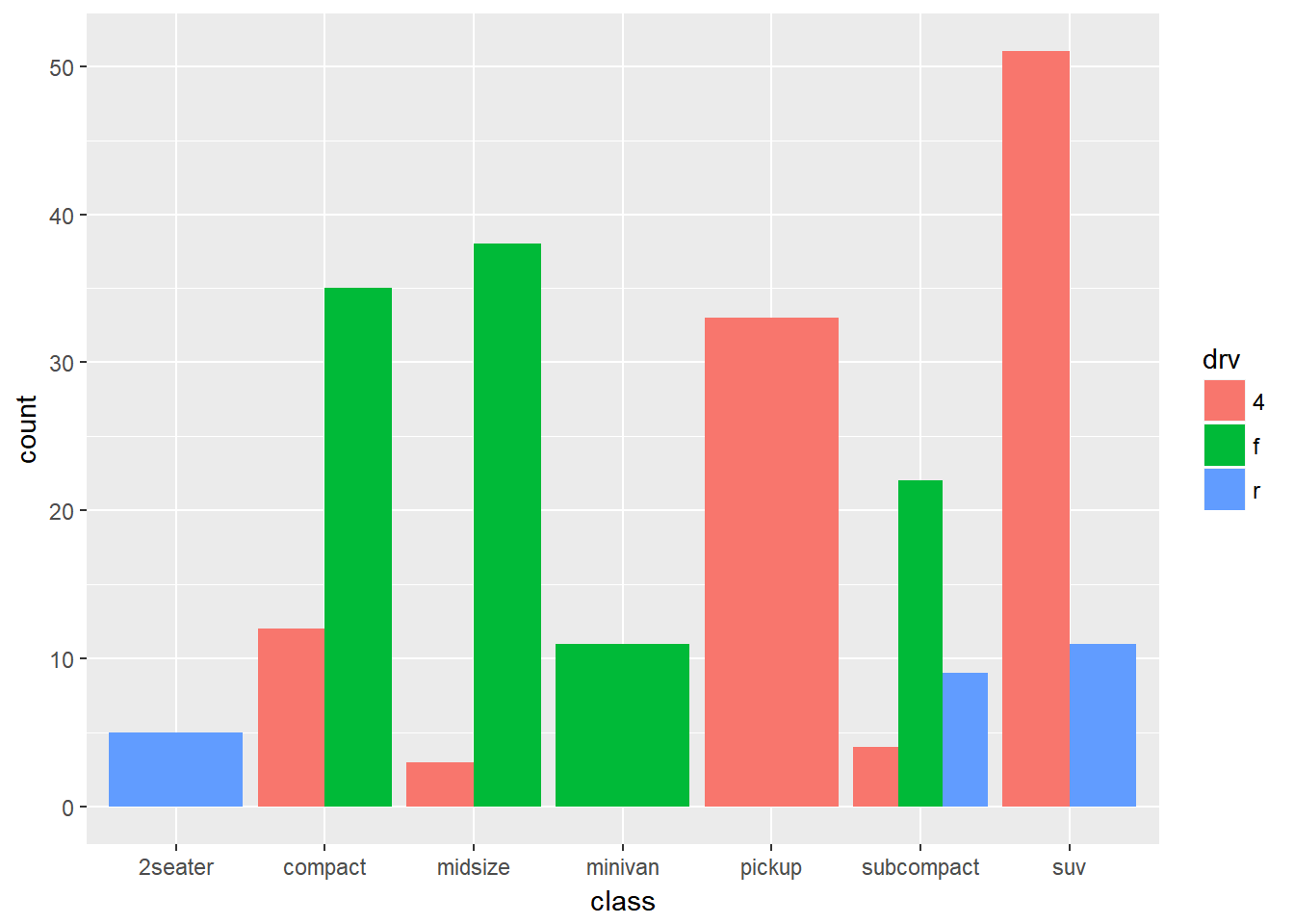
# position = "fill": percentage chart
ggplot(mpg, aes(x = class, fill = drv)) +
  geom_bar(position = "fill")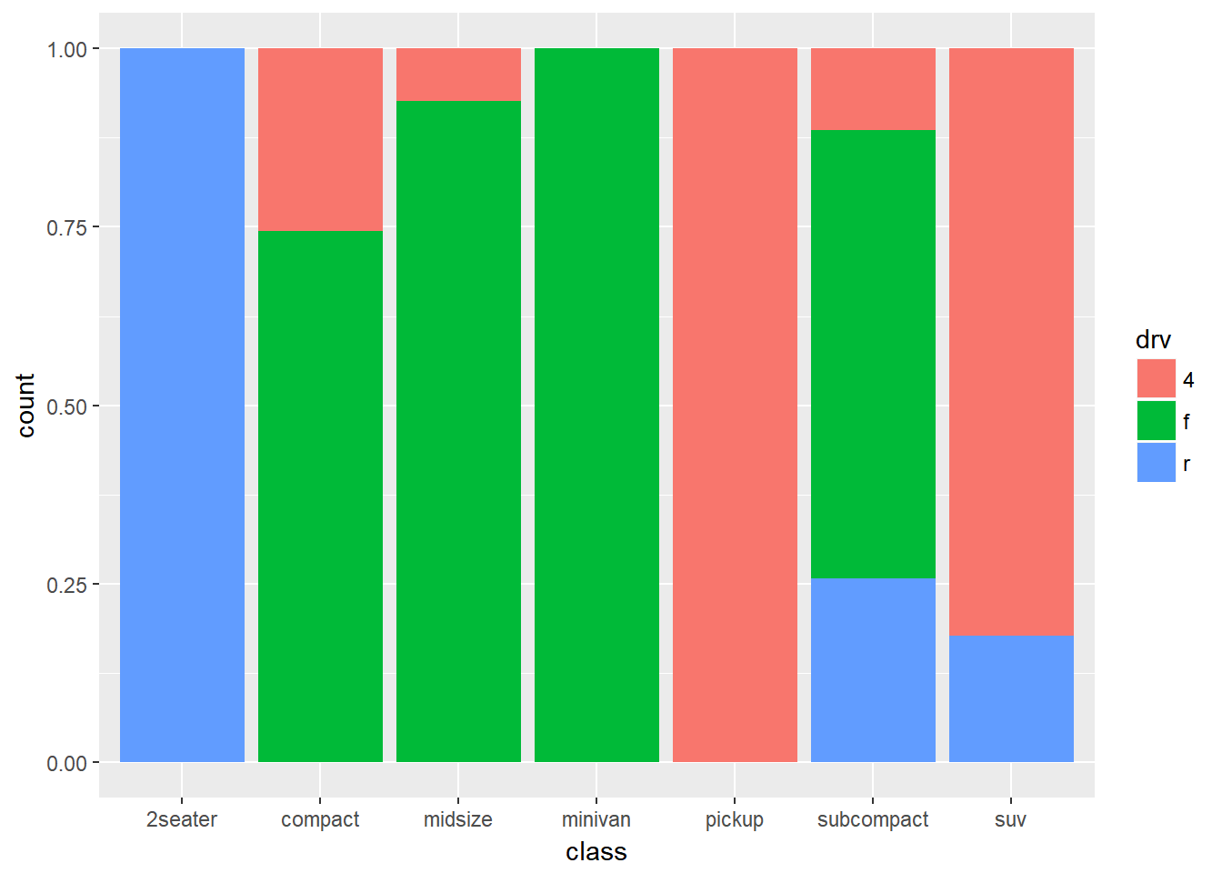
Check the documentation for each particular geom to learn more about its positioning adjustments.